DOBRE przykłady
Sector Report for the City of Katowice
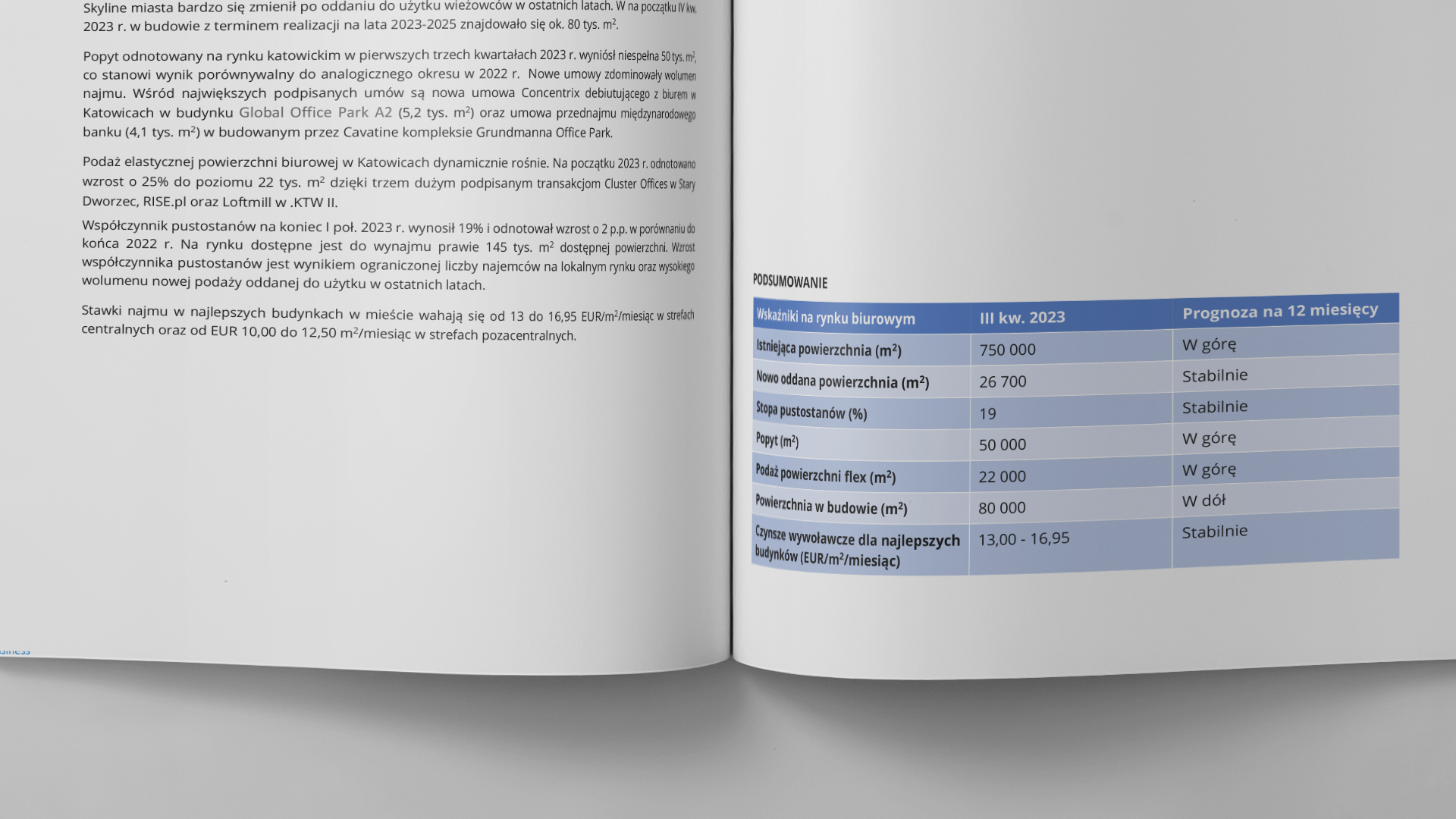
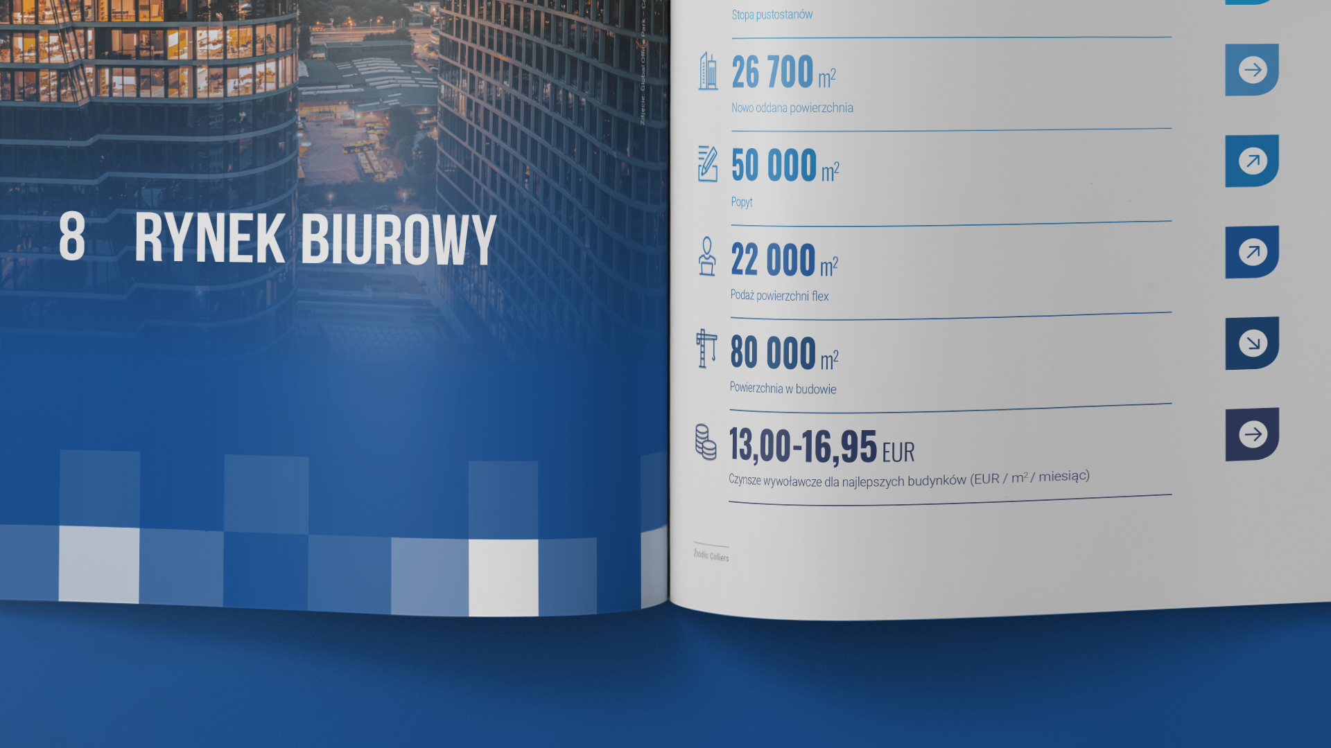
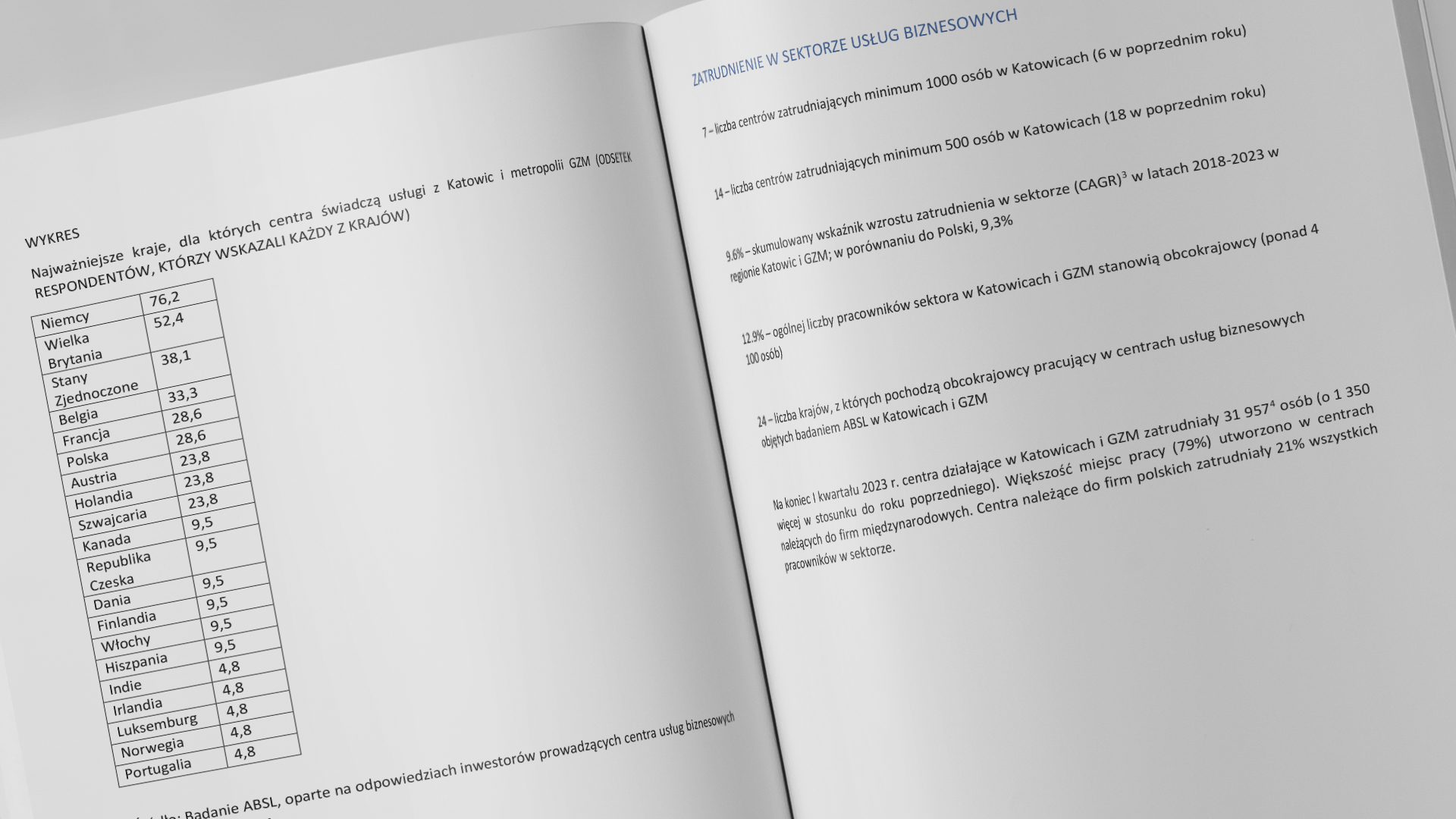
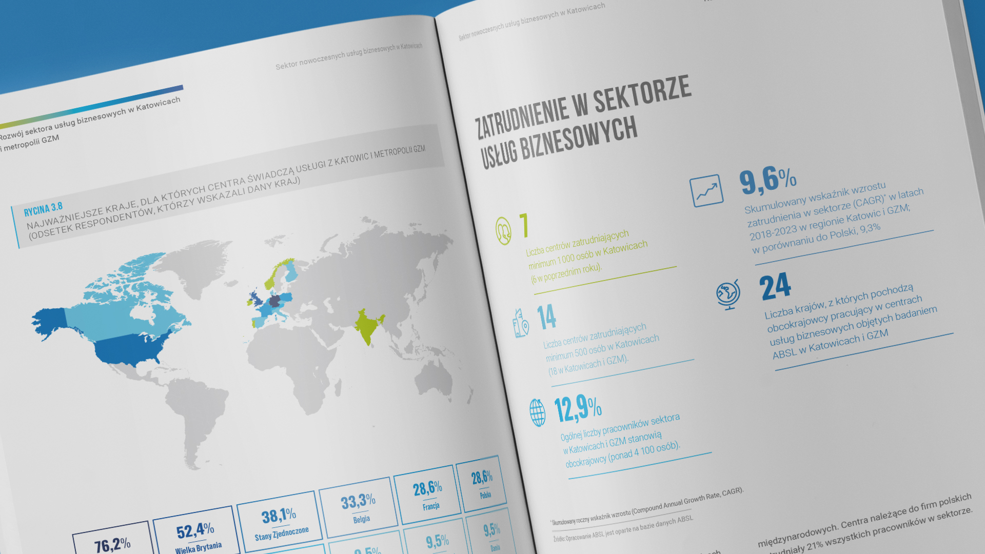
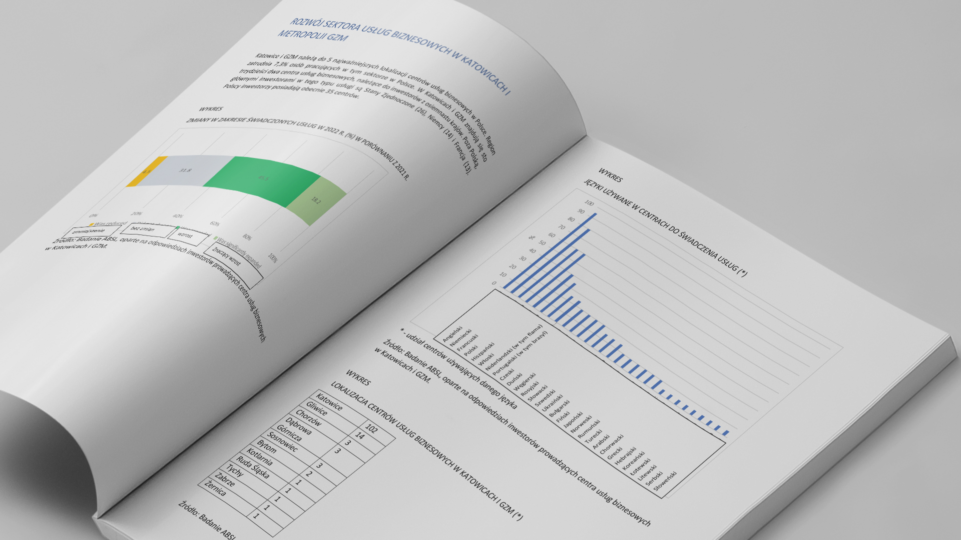
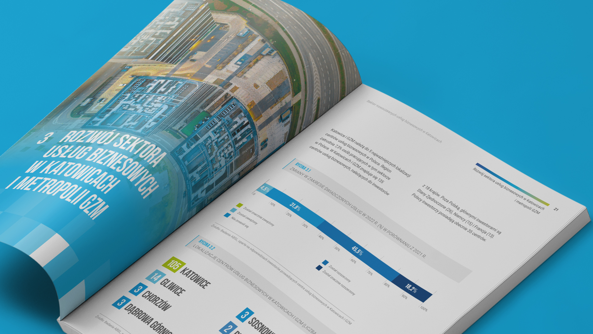
Bare tables and charts undergo a transformation under the watchful eye of our GOOD team. To ensure they look their best, we use infographics, pictograms, graphical data visualizations, eye-catching chart presentations, and other tricks. With us, even a complex, multi-level table gains a friendly, clear, and professional look.
Do you want your report to be a convincing argument, proof of success, or help you achieve your goals? Leave it with us – we will create a tool that will support you both during the presentation and afterward, leaving a lasting positive impression. By sliding the images, you can see how raw content turns into good reports.
About the Collaboration
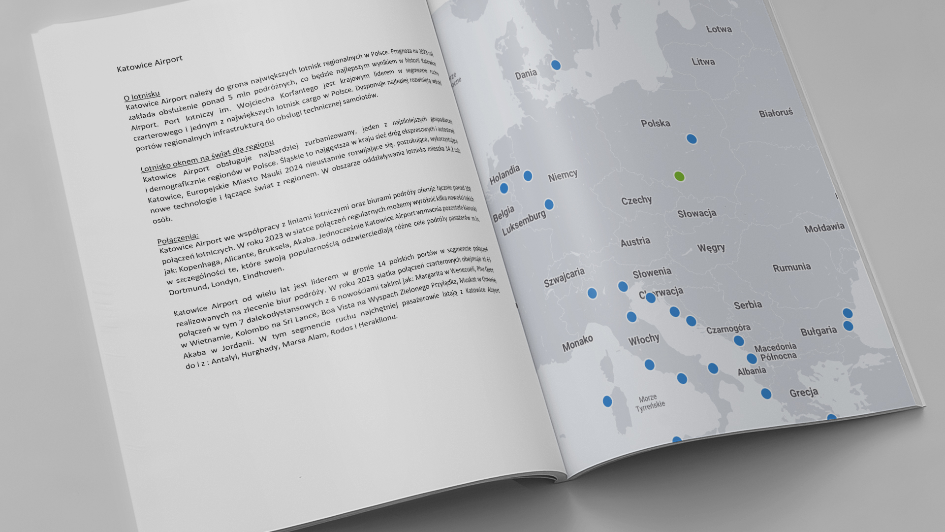
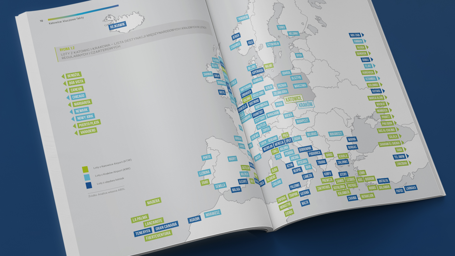
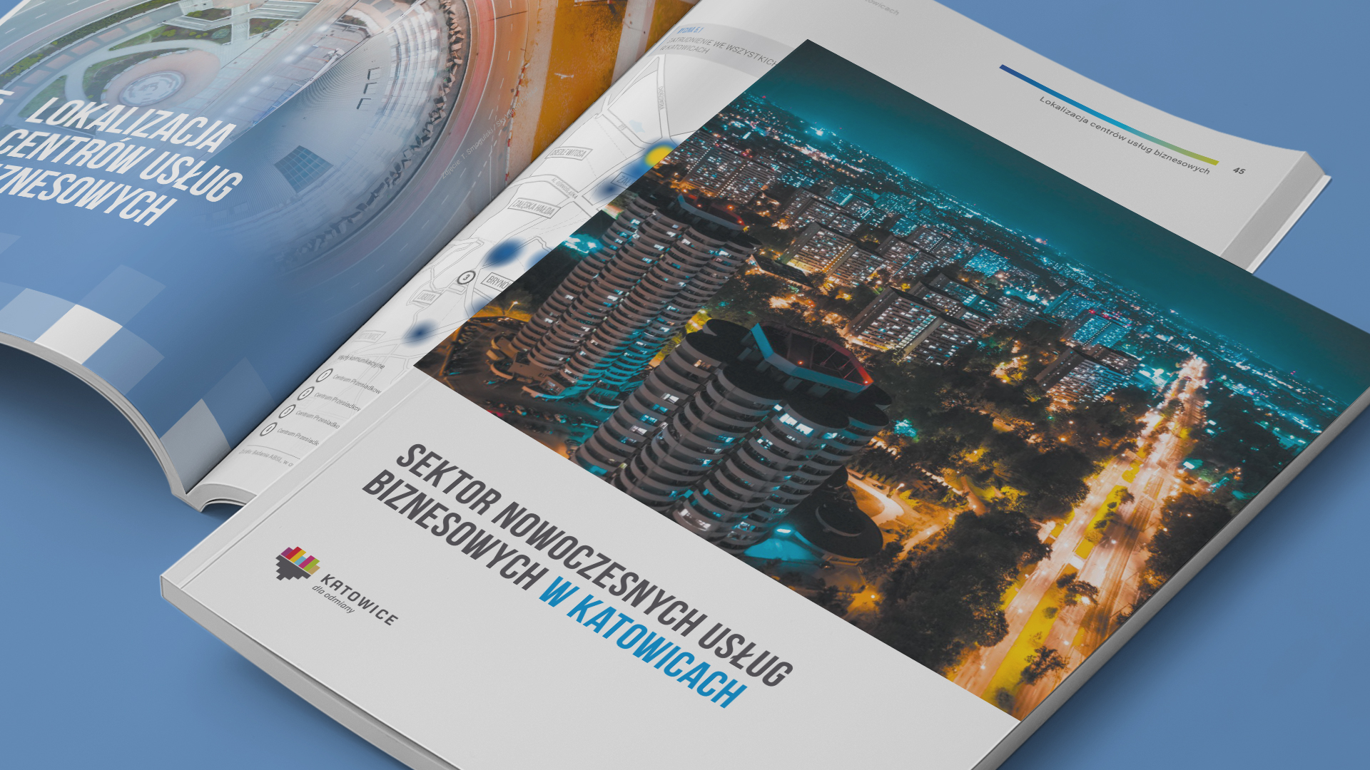
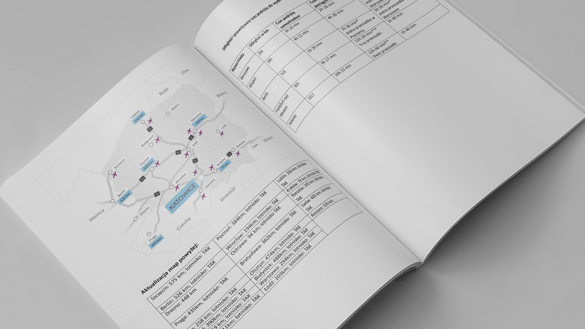
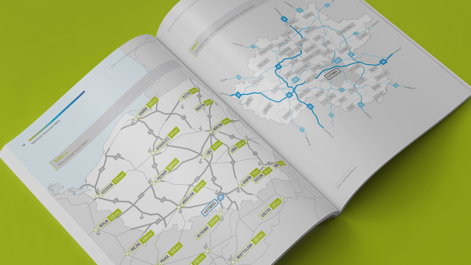
The graphic design of the sector report for the City of Katowice and ABSL, the content authors, refers to the visual identity of Katowice and uses the color scheme developed for the brand. The report is available on the City of Katowice website: invest.katowice.eu. The client provides text, tables, and data in the form of text files and spreadsheets. We also receive maps from the client, which we design according to our vision for the report’s layout. The full transformation of the visual elements is shown in our examples, where you can compare the received (left) and processed (right) content.
City of Katowice
Live report